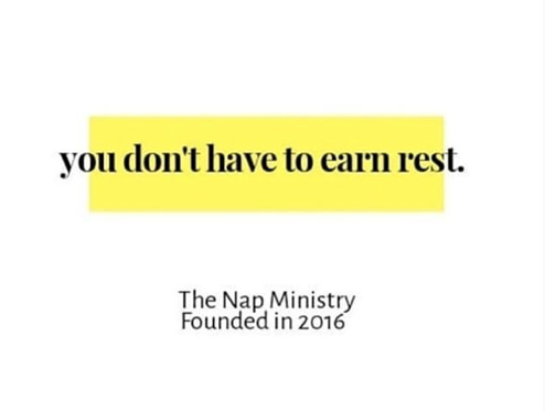
Screen-Shot-2020-07-02-at-3.37.58-PM By | July 2, 2020 | 0 ← I think we need less copy in this section. delete the Kelly Diels description, hashtag, and button. Let’s move the Kelly Diels description, hashtag and button much lower down in the site I love the twinkling stars. What a gorgeous touch The pink flowered block behind the text – the positioning feels odd/distracting to me. I like where it is going, though. I see that it is connective tissue/echo to the rest of the page. Can I suggest that it would be easier to read if it looked like the attached file for Nap Ministry? I TOTALLY accept pushback if you don’t like this suggestion.